bold Ideas for Colorful Interiors
Colorful interiors feel like a shot of espresso for the soul. Seriously. They wake up a space instantly. For me, they say someone actually lives here. Someone bold, curious, not afraid to mix a rusty orange velvet sofa with a dusty lilac rug or throw cobalt blue on the kitchen cabinets just because it sparks joy.
When I walk into a room that’s full of color, I immediately feel the personality behind it. It’s like the opposite of sterile. Color gives context. It adds emotion. Like, warm terracotta walls? Feels grounded and cozy. Chartreuse dining chairs? That’s playful and a little rebellious. Deep teal bathroom tiles? Dramatic in the best way.
I also love how color changes the mood depending on the light. You wake up in soft morning light and your walls feel peachy and mellow. By afternoon, they’re buzzing. It keeps things interesting without even trying.
And honestly, it’s way more forgiving. If your home is colorful, it doesn’t need to be perfect. It just needs to be you.
This post may contain affiliate links, meaning I earn a small commission if you purchase through these links, at no additional cost to you. I only recommend products I genuinely love and think you’ll love too. Your support helps keep this blog running – thank you!
Color psychology in home decor
I personally think color psychology in home decor is very real – like, even if you don’t realize it, your brain totally does. Color affects how a space feels, how you feel in it, and even how long you want to stay there. It’s not just aesthetic – it’s emotional.
Yellow = energy + optimism
But too much? It can feel chaotic. I like it best in kitchens or breakfast nooks – spaces where you want a little boost. Think soft mustard or pastel lemon, not highlighter.
Blue = calm + clarity
Blue is the spa color. Great for bedrooms and bathrooms. Lighter blues feel fresh and airy, deeper blues feel cozy and cocoon-y. Navy in a reading nook? Elite.
Green = balance + growth
Green is honestly magic. It’s grounding and restorative but still has personality. Perfect for literally any room. I love sage in a bedroom, olive in a kitchen, or emerald in a study/library moment.
Red = drama + stimulation
Red is tricky. It can be amazing – like a glossy oxblood powder room? Gorgeous. But too much and it gets overwhelming fast. I see it more as an accent than a base.
Purple = creativity + luxury
Very mood-specific. Lavender is soft and romantic, while eggplant feels moody and a bit mysterious. Works great in places where you want to feel a little indulgent (like a glam dressing room or a luxe guest bath).
Neutrals = your emotional baseline
Beige, white, greige, taupe, these are the reset buttons. I think of them as your visual breathing space. But they need contrast and texture, or they just fall flat.
the Most Inspiring Colorful interiors
Cozy Eclectic Living room
This room feels expressive and layered. It’s one of those spaces where you could spend hours just looking around and still find something new. Like that butterfly frame on the shelf? Or the perfectly placed greenery? These aren’t random choices – they’re all little intentional mood moments.
And the sofa? I mean… come on. That deep velvet blue Marenco Sofa by Arflex? Rich, moody, and super luxe without being stuffy. The squishy silhouette makes it approachable, not formal. It’s the kind of sofa that says, “yeah, you can sit here and eat snacks.”
The room’s built on a neutral shell – soft blush walls, creamy tones – but the color pops are what bring it to life.
That yellow Pols Potten Zig Zag side table? Ugh. A star. It plays perfectly with the rust-toned pipe detail on the wall.
The clear shelving is so smart. It lets everything breathe. Books and vases feel like floating art instead of visual clutter.
MODERN whimsical interior
with a Pop Twist
Oh, man. That aesthetic? This whole space just gets it. It doesn’t take itself too seriously, but it still feels really intentional. It’s the kind of place where you’d wanna host a Sunday brunch and then end up lounging till dinner.
That yellow cabinetry?? Pure joy. And I love that they used those cute multicolored knobs, it adds personality without getting cheesy.
The white tile backsplash with the scallop pattern is super smart. Keeps the kitchen feeling light and adds just enough visual interest without competing with the yellow.
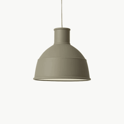
The matte olive pendants? Perfect curveball. They tone everything down a bit. Earthy, a little unexpected, but they tie in with the more muted touches in the space.
Those deep teal arched doorways in the living room? Ugh. So chic. Architectural and graphic at the same time. Total upgrade from just painting a door. And teal works so well with the mustard and rust tones happening elsewhere.
The coral armchairs are such a strong move. They pull your eye in right away and balance out the cool tones with warmth.
The striped rug and patterned pillows add just enough texture. Nothing feels flat. It’s layered, but still breathable.
It doesn’t look wild, though. That’s the secret. All the color looks considered. Curated. Like someone actually understands balance and tone. You can tell that they were playing around with it, but there’s a designer’s hand under the chaos too.
So yeah.10/10 would move in tomorrow. No bad criticism. Maybe just throw some funky fruit bowl or something sculptural on the countertop, but that’s me being a nitpicker.
DOPAMINE HOME
This space feels lived in, but every inch is thoughtful. It’s clearly made for someone who values aesthetics but also…comfort. Nothing is trying to look like a showroom. There’s storytelling in every corner. The art, the materials, the lighting – everything’s been chosen, not just bought.
It’s the kind of home that invites you to slow down. Read. Cook something good. Listen to old records. Open a bottle of wine (or like…a fancy kombucha).
So yeah – this apartment to me feels like balance. Beauty and ease, all in one.
The plywood wall + plants? Game changer. It brings in this Scandi-jungle thing that feels really natural and unfussy. That shelf line for the plants? Genius. It draws the eye up without adding clutter.
The mustard velvet sofa is so good. A real hero piece. Soft, plush, a little ‘70s, but styled in a way that feels elevated, not dated.
That terracotta ceiling box over the kitchen? I almost screamed. So smart. It zones the space visually without putting up a single wall. And that muted sage green cabinetry underneath it? Perfect pairing.
Color blocking moments (like that bookshelf with the deep red backs) give little dopamine hits without overwhelming the room. Super intentional.
The light blue pendant above the dining table is like a little breath of fresh air. Softens all the earthy tones just enough.
Elegant maximalist decor
It’s like a poem. Soft, soulful, and full of quiet personality. The whole thing whispers, not shouts.
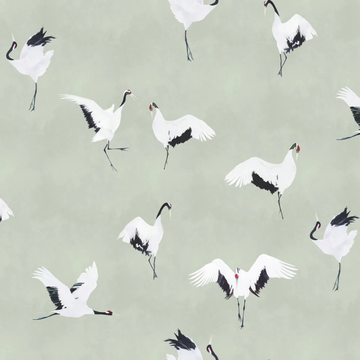
The arched mural feels delicate and thoughtful, like a peaceful little world tucked into the wall. The Tachno Sage Wallpaper by Maicon C is such a calming backdrop, and the birds bring that sense of movement and freedom. I’m obsessed with how it’s framed like a niche.
Now let’s talk about the color palette: Rust, black, cream, and sage? It’s a masterclass in earthy but elevated. That dark red Pols Potten chair feels mid-century but still super soft, not too rigid. And it ties in with the oxide red Matin wall scones by Hay without getting too matchy.
Accent color
Soft beiges, warm wood, and that fresh sage green accent? It’s neutral but not bland. There’s movement and texture everywhere – woven curtains, the tree branches in the sculptural vase, the herringbone floors.
That green Pols Potten Zig Zag side table is such a subtle statement. Adds a little punch of color in a room that’s mostly tonal. It’s like a visual sorbet—refreshing, but not overwhelming.
Total sensory reset. It’s giving quiet luxury meets cozy Nordic spa.
Electric Elegance with a Brut Pop Edge
Okay… this colorful interior? Jaw. Drop. It’s confident, stylish, layered, and unapologetic.
It’s like someone took mid-century modern, Italian radical design, and a splash of comic book energy – and blended it all into something totally original. It’s bold, it’s a little chaotic (in the best way), and it absolutely knows it looks good.
That rich emerald green built-in steals the show. It’s not trying to blend in – it wants to be the main character. It’s glossy, punchy, and totally fearless.
Then you’ve got that smoky red/orange Bohemia Pendant by Marset floating like a spaceship over the dining table. Retro-futuristic and totally unexpected.
Color-blocked furniture (like the vintage, red Vico Magistretti Carimate chairs and cream chairs) and the Coco Davez Frank Zappa artwork just reinforces that intentional playfulness. There’s zero hesitation here – and it works.
And THE SOFA. That velvet-y, tufted, super-sculptural deep Camaleonda green sofa? Stop. It looks like a cloud but in a luxury nightclub kind of way. I want to sink into it and never leave. It adds depth and softness to all the saturated tones around it.
Electric Elegance with a Brut Pop Edge
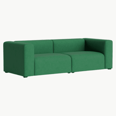
Mags Sofa
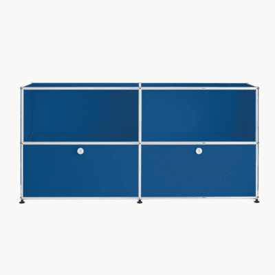
USM Haller Credenza
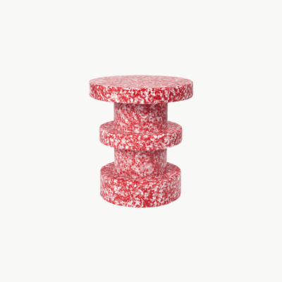
Bit Stool
Okay – this one’s pure joy in colorful interior form. It’s fun, bold, a little chaotic – and totally owning it.
The green sofa is such a strong base, and then you’ve got that electric blue USM unit, the graphic wall art, and that wildly perfect bubblegum terrazzo side table?? It’s like a design playground, but make it curated.
Feels super playful and personal. Like someone creative and unafraid of color lives here – probably a designer, illustrator, or someone with a very fun sock drawer.
palm springs decor

Safari Tufted Rug
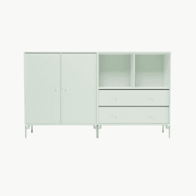
Dining Cabinet
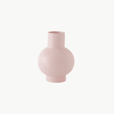
Strom Vase
This space is about joy, plain and simple. It’s whimsical, expressive, and clearly curated by someone who doesn’t care about trends – they care about fun. It’s giving “grown-up with a sense of humor” and “interior design is play, not pressure.
The bubblegum pink walls paired with mint green trim? That’s bold. But the muted lavender door and soft pastel storage keep it balanced.
The archway painted in coral and red adds so much drama. It frames the space like a stage set. Major maximalist energy.
That Safari Tufted Rug by Ferm Living? Totally weird and totally perfect. It softens the floor and adds even more personality.
And that vintage floral print above the sideboard? Feels like it came straight from a ‘70s teen bedroom – so kitschy it’s chic.
perfect pastel dream
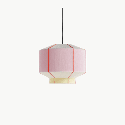
Bonbon Shade
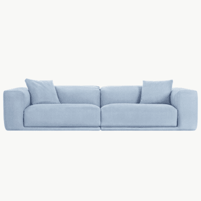
Kelston Sofa
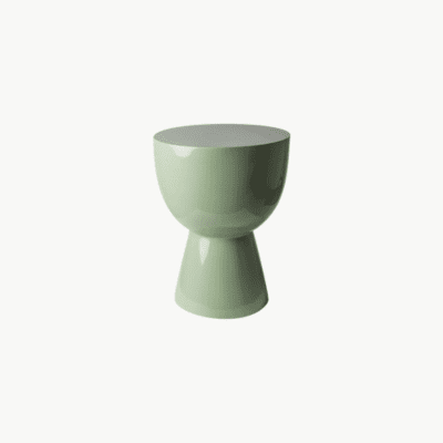
Tip Tap Stool
The architecture isn’t fighting the palette. That exposed red beam, the graphic art, and the natural light from the skylight ground everything. It feels fresh and modern, but not sterile. It has soul.
And that pastel mint pouf in the lounge? I want ten.
This one is such a perfect pastel dream, it almost feels like it belongs in a graphic novel. It’s soft but architectural. Whimsical and structured. And honestly? I love it.
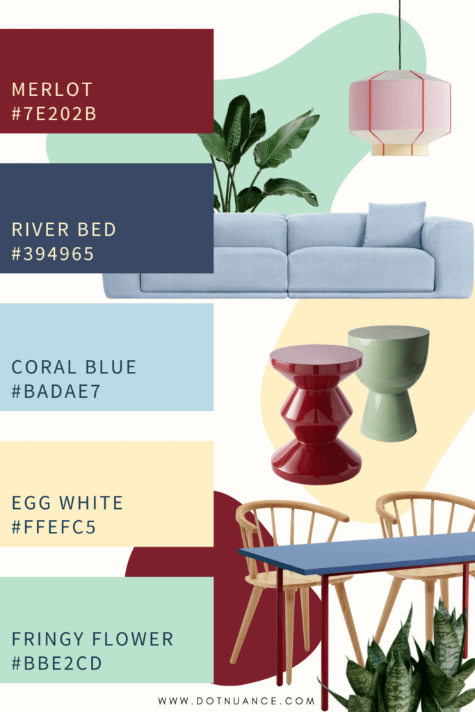
The color blocking is so intentional. Mint green walls, powder blue sofa like the Kelston Sofa by Case, lilac dining table, buttery wood chairs – it’s giving ice cream shop but make it chic.
That octagonal Bonbon Shade by Hay? Obsessed. It brings this little geometric punch that balances all the curves and softness happening below it.
The striped pillows and candy-colored taper candles just push the whole playful palette even further – without tipping into chaos. It still feels calm.
white with pops of color
Neutral base, warm wood floors, pops of blush and pastel green – this is how you do soft color without losing sophistication. It’s muted, but still full of life.
Those minty green puffy chairs? Total showstoppers. They’re soft, low, and curvy – like little clouds with attitude.
The oversized pink wavy mirror is giving big personality without overpowering. It adds that sense of play that keeps the space from feeling too serious.
And can we talk about those clustered pendant lights? Super graphic. It draws the eye up and makes the ceiling feel taller. It’s all about volume without visual weight.
#colorfulinteriors
