Blue X Burgundy Color Palette
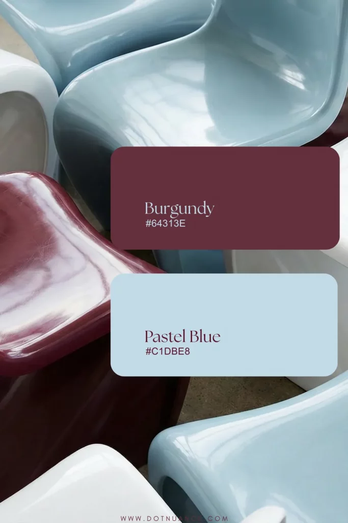
Some color palette just click. Blue and burgundy is one of them, where warm meets cool. Soft meets deep. What I love is how blue and burgundy create tension and contrast.

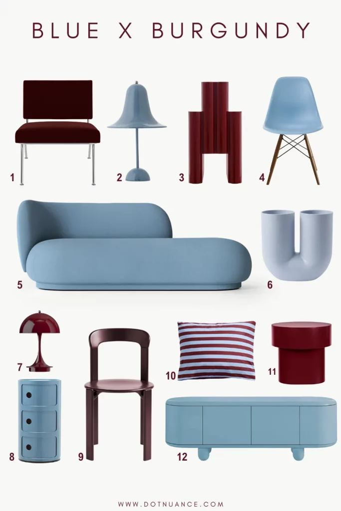
1 Knoll – Model 31 Lounge Chair
2 Verpan – Pantop Portable Table Lamp
3 Kartell – Magazine Rack
4 Herman Miller – Eames Molded Plastic Chair
5 Ferm Living – Rico Divan Sofa
6 Muuto – Kink Vase
7 Louis Poulsen – Panthella Portable Table Lamp
8 Kartell – Componibili Storage
9 Hay – Rey Chair
10 Hay – Été Pillowcase
11 Hem – Stump Side Table
12 BD Barcelona – Explorer Cabinet
Blue brings air, burgundy brings weight. Together they create beautiful friction. Solid, balanced, unexpected.
There is also psychological layer. Blue calms, burgundy comforts. The mix sits right between cool intellectual and human warmth. People crave color, but in a controlled way. Not dopamin decor, not maximalism, something grounded, but with depth.
Timeless. Warm. Elegan.

The Palette in practice
The pairing thives when handled with restraint. This palette needs space. Use blue as a base, walls, upholstery, cabinetry, or even a lage rug. Burgundy enters later, as punctual and sculptural accent. A lamp, a table and suddenly the room feels deeper. That quiet interruption that gives depth to the space.
This product set is thoughful and cohesive. Strong silhouettes, honest materials. A couple of pieces are precious (Explorer, Kartell) but they buy you that editorial finish.
A Rico Duvan Sofa by Ferm Living in powder blue is soft, generous, a little retro but still clean. The Rico Duvan Sofa anchors the space with its soft form. Its gentle curves contrasts perfectly with Hem’s Stump Side Table in burgundy.

Lighting is where you can really start to play. Like the Verpan’s Panton Lamp or Louis Poulsen’s Panthella lamp, both come in light blue and burgundy. Both lamp in both color make the space feel layered. These lamps carry a sense of intimacy, portable, glowing, sculptural.
Arguably one of the best burgundy accent you can make is the Magazine Rack by Kartell. Deep, glossy burgundy finish adds vertical rhythm among softer forms.
Add a Muuto Kink Vase in muted blue or a Hay Été pillowcase to bidge the tones.
Materiality and depth
When you use blue and burgundy together, they need a birdge. Something that softens the contrast and the hues. Otherwise it can start feeling too tense.
So what would I add?
Warm neutrals. A soft mushroom, bone white or plae taupe. These tones bring light back into the space.
Walnut or smoked oak. Wood makes this palette feel human, more balanced. It adds that slow furniture, lived-in energy.
Brushed brass or chrome. Metal finishes matter here. Like the Florence Modell 31 by Knoll. The chrome legs bring needed contrast with plush velvet. Looks expensive, because it is…
The thing I love about this palette is how blue gives clarity and burgundy gives comfort. It is calm but not sleepy, bold but not loud. This color combo is timeless in that unpretentious was.

