
Mies van der Rohe
The master of modernist architecture
So – Mies van der Rohe. I’ve got a lot of love for him. He’s kind of a legend in the design world, right? Like, if you’ve ever been into minimal interiors or those super sleek glass buildings that feel calm and powerful at the same time – that’s basically him. He’s the guy who coined “less is more”, and he lived it. His stuff is simple, but not boring. Clean, but not cold. Okay, maybe sometimes a little cold, but in a chic way.
His philosophy of “less is more”
continues to influence architects and designers worldwide.
What I really like about Mies is that he wasn’t trying to impress anyone with trends or flashy stuff. He cared about space, proportion, balance. The architecture kind of just breathes. Everything he did feels really intentional, like he stripped things down to their essence and somehow made that enough. And that’s hard. Like, minimalism done well takes serious skill.
The architect Who Made “Less Is More” Cool
Ludwig Mies van der Rohe didn’t go to architecture school. He didn’t need to. He was born in 1886 in Aachen, Germany, into a stonemason family. His dad taught him to work with his hands. Told him straight up:

Don’t read these dumb books. Work.
And honestly? That mindset stuck. At 19, Mies moved to Berlin. He worked for Bruno Paul, then joined Peter Behrens’s studio. Behrens had a gift for grand form, and Mies learned a lot – but later realized architecture wasn’t about inventing new shapes.
It was about solving problems.
That became his thing. He admired Karl Friedrich Schinkel’s calm, classical buildings. Also studied Hendrik Berlage, who believed architecture should be clear, honest construction. And that’s exactly where Mies was headed.
What He Believed In
Mies cared about one thing above all: clarity. His buildings had to make sense. No gimmicks. Just clean structure, flowing space, and perfect details.
He didn’t want to create a “style”. He wanted to create principles anyone could use. His goal? Buildings that didn’t boss you around. That could adapt as life changed.
Here are a few things he kept coming back to:
Free plans
Walls that didn’t hold anything up, so layouts stayed flexible.
Flowing space
Rooms that connect at corners and lead you forward.
Universal space
Big open rooms that work for anything, anytime.
Structure vs. walls
The frame holds everything. The walls are just skin.
Details matter
Every edge, every joint, had to be right.
Buildings + landscape
They should work together, not compete.
Personally, I love how timeless this thinking is. He didn’t just chase beauty – he chased order. And it shows.
His Early Work in Europe
Mies’s first built house, the Riehl House (1908), already played with space and landscape. Then came more traditional homes like the Warnholtz and Urbig Houses, with a little Schinkel flair.
But after World War I, things shifted. He got bold.
He drew up all-glass skyscrapers in the 1920s – years before anyone could actually build them. Then he experimented with concrete and brick houses that had super abstract plans. Kind of like architectural sketches made real.
Then came the hits:
Weißenhofsiedlung (1927)
A modern apartment block where structure and walls lived separately.
Barcelona Pavilion (1929)
Marble, glass, and steel flowing effortlessly. A true icon.
Tugendhat House (1930)
A luxurious home with glass walls that disappeared into the garden. Absolute dream house.
He even led the Bauhaus from 1930 to 1933. But when the Gestapo came knocking, he shut it down. His practice slowed under the Nazi regime. In 1934, he signed a loyalty oath – something later criticized. Still, he kept working. Projects like the Hubbe House showed he was still exploring ideas around openness and enclosure.
Moving to America
By 1938, things in Germany were going downhill fast. Mies was 52, spoke no English, and had no commissions. But he got an offer to teach in Chicago at what’s now the Illinois Institute of Technology (IIT). He took it – honestly, bold move – he escaped Germany just in time. And he started over.
Reinventing in the U.S.
America gave him room to build. Literally. At IIT, he designed the campus using a simple grid. He said the grid gave form to an idea. And everything was built around that.
He saw structure – especially steel – as the spirit of the modern age.
Key projects from this era
Minerals and Metals (M&M) Building (1941–43)
Exposed steel, no hiding.
860–880 Lake Shore Drive (1951)
Glass-and-steel towers that still define the Chicago skyline.
Seagram Building (1958)
A bronze skyscraper in NYC with a public plaza. So refined. So good.
Crown Hall (1956)
A huge, open space for architecture students. He called it “the clearest structure we have done”.
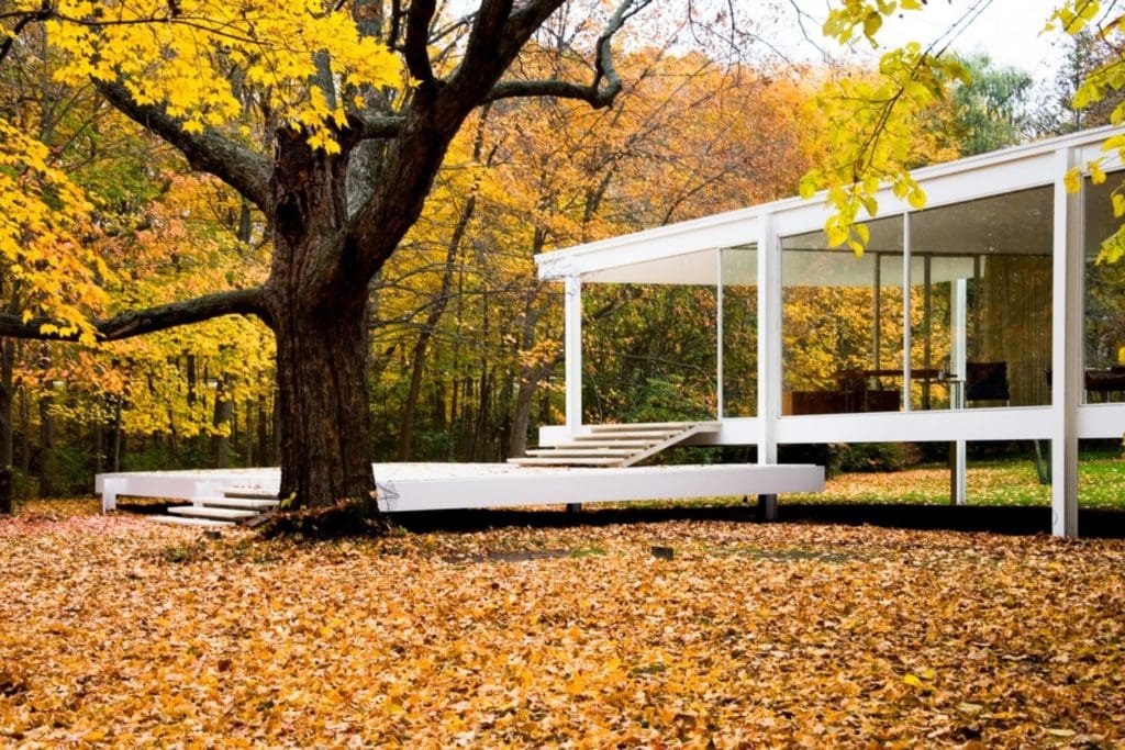
Farnsworth House (1951)
A glass box in the woods. It floats. It glows. It’s stunning.

His later projects – like the Federal Center in Chicago and the Toronto-Dominion Centre – brought that calm order to the city scale. Some people said his office got a little repetitive. Maybe. But honestly, when the concept works, it works.
His last major building was the Neue Nationalgalerie in Berlin (1968). A glass hall under a huge steel roof. Pure Mies.
Mies’s Furniture
Modern Architecture in Chair Form
Mies learned furniture the same way he learned buildings: by doing the work. While drafting for Bruno Paul, he tried his hand at tables and chairs and loved it. Early pieces for the Werner House followed Schinkel-style classicism – formal, balanced, well made. Later, furniture for the Wolf House (some co-designed with Lilly Reich) stayed strict and plain.
By 1927, at the Weißenhofsiedlung, he saw a gap. Buildings had gone modern; furniture lagged behind. So he jumped back in and pushed things forward.
His secret weapon was Lilly Reich. Together they tested new materials, cleaner lines, and smarter ways to build. Their partnership shaped a whole vocabulary for modern interiors.
Furniture wasn’t decoration for Mies – it was part of the architecture. In the Tugendhat House, he and Reich created a total artwork: built-in dining tables, movable lounge pieces, even outdoor chairs matched to the terrace. Exhibition spaces like the Plate-Glass Hall used a few well-placed pieces to shape entire rooms. In Philip Johnson’s New York apartment, they mixed Barcelona and Tugendhat chairs with a daybed credited to Reich.
Craft mattered. Mies’s stonemason roots meant every weld had to be perfect. So he patented many designs, though copies popped up everywhere. But true mass production came later in the U.S., when he re-detailed classics like the Barcelona chair for stainless-steel runs.
Although Mies stopped creating new furniture after his mid-forties, the existing pieces continued to show up in his lobbies, offices, and apartments – especially at 860–880 Lake Shore Drive. Even today, they’re still being used. For a deeper look, Ludwig Glaeser’s book is the go-to source.
Furniture icon’s of Mies van der Rohe
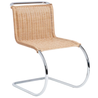
MR Chair (1927)
First shown at Weißenhof. It’s a cantilever, so the seat floats with no back legs. Tubular steel, leather sling, smooth curves. While Mies credited Mart Stam for the idea, he fine-tuned it until it felt effortless.
Part of the Bauhaus vibe, big time. Less industrial, more refined. The MR Chair has that dreamy cantilever form that makes it look like it’s floating midair. Usually has leather straps or a sling seat.
Modernist beach house or chic reading nook. It gives “cool professor who owns too many art books”.

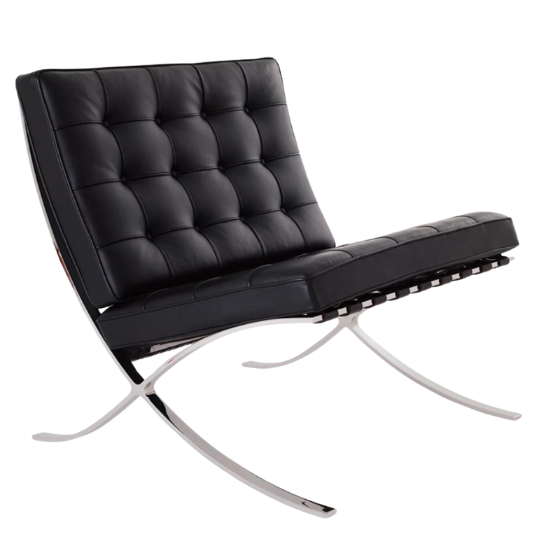
Barcelona Chair & Ottoman (1929)
Made for the 1929 Barcelona Pavilion. Mies wanted something fit for a king and queen yet light on the eye. The frame is razor-slim steel; the cushions rest on leather straps. Heavy to move, yes, but still “the chair of the century”.
Designed with: Lilly Reich (his longtime collaborator – let’s give her the credit she deserves).
For: The German Pavilion at the 1929 International Exposition in Barcelona.

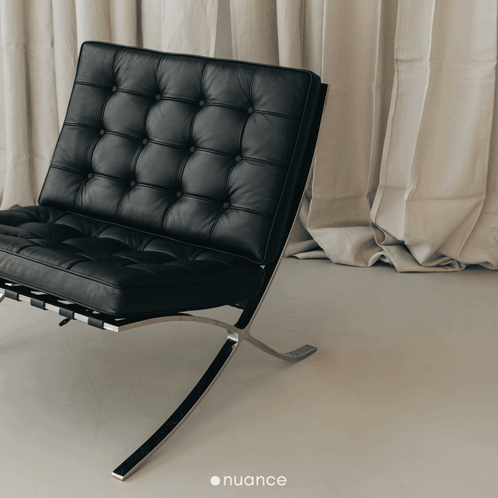
Sculptural, but functional. The polished stainless steel frame has this continuous curve – no breaks, no joints. Just smooth. And the leather cushions are hand-stitched and button-tufted, so it feels elevated but never fussy.
It’s like sitting on a throne, but make it modern. It was literally designed for Spanish royalty, which tracks. It looks amazing in open, airy rooms with lots of natural light. So to say, it does not need a lot around it – let it breathe.

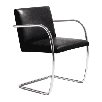
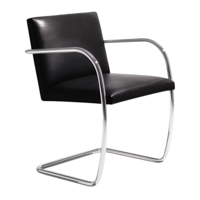
Brno Chair (1930)
Mies designed the Brno chair for the Tugendhat House in 1930. He needed a dining/desk version of the MR side chair, so he added arms and flattened the curve of the frame. That way the chair could scoot closer to the table.
Super clean. Super modern. The Brno Chair comes in two styles – tubular steel or flat bar – and both are so chic it hurts. The frame cantilevers, which means the seat kind of floats. That makes it look light and effortless, but it’s also sturdy.
Two versions exist: one in tubular steel, the other in flat-bar steel. The flat-bar model looks stunning – but it’s almost too heavy to slide out.
Like many of his pieces, mass production waited until the late 1940s in the United States, where the chair was re-detailed in polished stainless steel.
Designed also with: Lilly Reich
Originally for: Tugendhat House in Brno, Czech Republic
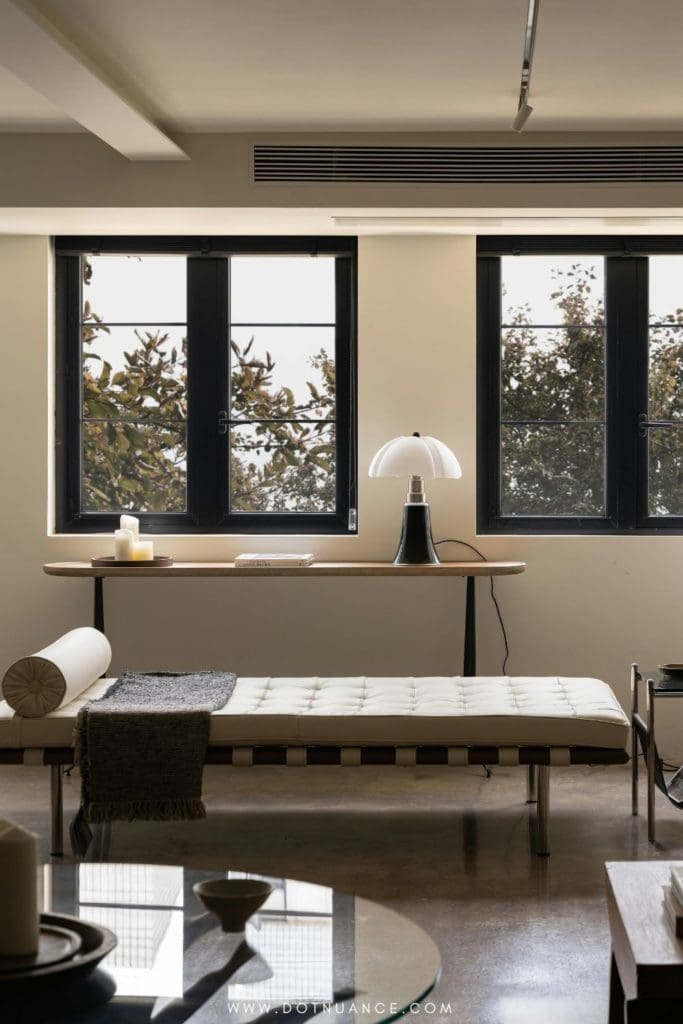
Barcelona Daybed
The low couch most people call the Barcelona daybed wasn’t for the Barcelona fair. Mies and Lilly Reich designed it for Philip Johnson’s New York apartment in the early ’30s.
Structurally, the daybed is a hybrid – sculpted wood frame resting on chromed (later stainless) tubular-steel legs.
Recent research credits the design to Lilly Reich. She often blended steel and wood in her own work, so that tracks.
The piece also showed up in the Crous apartment in Berlin.
Knoll has produced the “Barcelona couch” since 1953 – long after the fair, but it keeps the look alive.

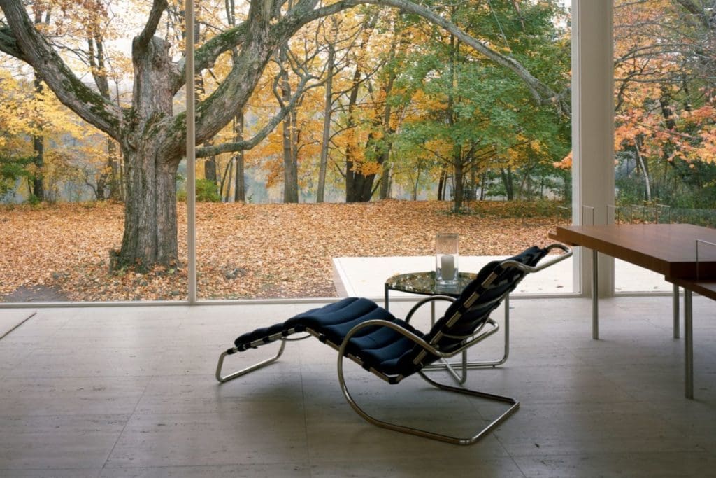
Tugendhat Chair
Designed for the Tugendhat House (1930) as a modern lounge chair. Goal: match the cushy comfort of old-school overstuffed seats – but look light and current.
Uses arms and a flat steel-bar frame that works like a spring. You get a gentle bounce instead of a hard perch.
Cushions echo the Barcelona chair – buttoned leather, held up by leather straps on the frame. It was part of Mies’s flat-bar experiments, along with the Brno chair and X-table.
Knoll made the chair after the war but dropped it in 1976. It never sold like the Barcelona, yet fans say it’s actually the comfier seat.
The Man and His Legacy
At IIT, he trained a whole new generation of architects – people who would carry his ideas far into the future.
He loved art. Collected Klee. Read philosophy. Believed in discipline, fundamentals, and doing the work properly.
People said he had presence. He didn’t talk much, but when he did, it mattered. He wasn’t chasing fame, he was just chasing better buildings.
Mies died in 1969. But his legacy? Still everywhere.
Mies made spaces that feel calm. Smart. Balanced. He taught us that simple doesn’t mean boring. It means intentional. That’s something I try to bring into my own work every day.
He once said
Architecture starts when you carefully put two bricks together.
That kind of honesty? Still refreshing.
And if you’ve ever walked into a room and felt like you could breathe – well, chances are, someone was channeling Mies.
This post may contain affiliate links, meaning I earn a small commission if you purchase through these links, at no additional cost to you. I only recommend products I genuinely love and think you’ll love too. Your support helps keep this blog running – thank you!
Sources
Franz Schulze – Mies van der Rohe: A Critical Biography
Carsten Krohn – Mies Van Der Rohe: The Built Work