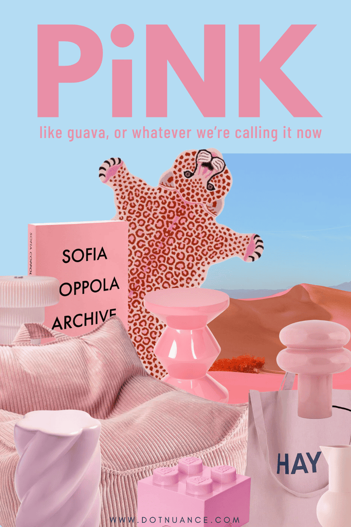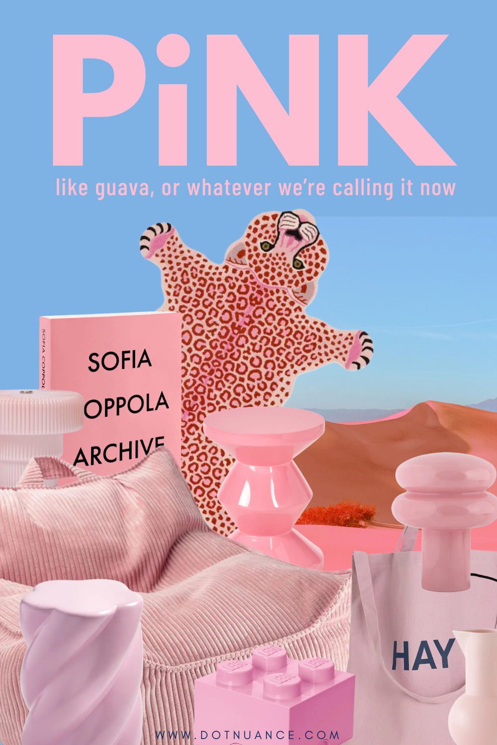
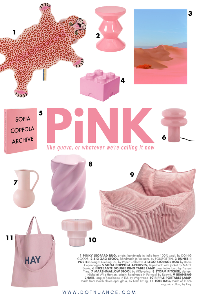
Pink, like sweet guava, or whatever we’re calling it now
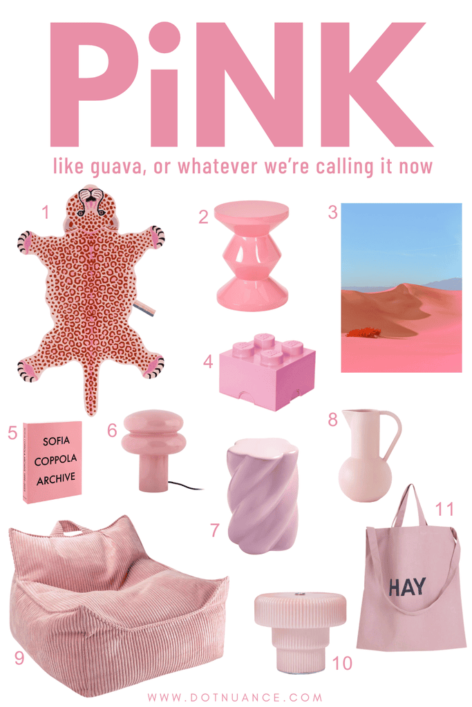
1 – Doing Goods – Pink Wool Leopard Print Rug | Pink
2 – Polspotten – Zigzag stools
3 – Paper Collective – Dunes II
4 – Room Copenhagen – Lego Storage Brick 4
5 – MACK Books – Sofia Coppola Archive 1999-2023
6 – Present Time Incesante Double Ring table lamp
7 – &Klevering – Marshmallow Stool
8 – Raawii – Strøm Pitcher
9 – Wigiwama – Beanbag Chair
10 – Ferm Living – Ripple Table Lamp
11 – Hay – Tote Bag
Sweet Guava is not a standardized Panton/RAL/NCS-type color with a fixed specification. “Livingetc.com” introduced it as its August 2026 “Color Crush” and describes it as a fairly saturated, mid-tone pink with a slight purple/blue lean, somewhere between pastel pink and hot pink.
So first, what pink actually means psychologically
The best source I found is a 2025 systematic review covering 132 peer-reviewed studies, more than 42,000 participants and 64 countries, spanning 128 years of research.
Pink emerged as one of the most cinsistently positive color categories. The strongest associations were, love, joy, pleasure & fun.
Pink-love appeared in 69% of the studies investigating pink and discrete emotions, and pink-joy in 63%. Pink was also repeatedly connected with pleasure and fun.
That’s much more useful than the usual pink is nurturing. Because the research suggests something slightly different. Pink is fundemantally a positive social/emotional color.
Love. Affection. Pleasure. Play.
Not necessarily tranquility.
And this is where Guava Pink becomes different from dusty pink. Color is more than just hue. Value/lightness and saturation matter enormously.
Across the research, lighter colors tend to correlate with more positive emotional association. But increasing saturation changes the energy of that positivity.
Desaturated colors went toward lower arousal and lower power.
So take two pinks:
Very pale dusty pink – love + softness + lower stimulation
Guava Pink – love + pleasure + higher stimulation
That is a pretty menaning ful difference.
So psychologically, I’d describe Sweet guava pink as affection, optimism, sociability, playfulness, moderate stimulation, rather than calm, healing or serenity and definitely not neutrality.
“Pink is the new neutral”
There’s a strange history behind the idea that pink is calming.
You’ve probably come across Baker-Miller Pink, sometimes called “drunk-tank pink”. Early experiments claimed that exposure to a certain bright pink reduced strength and aggression.
That became an enormous piece of pop color psychology.
But later, better-controlled research failed to replicate the aggression-reducing effect. A controlled prison experiment found no meaningful advantage for pink cells compered with grey ones.
Another older experiment did find a lower self-reported anxiety in a pink room, but not the claimed effect on psysical strength or motor performance.
And the big 2025 systematic reviwe is unusually clear about this distinction.
“we know colors communicate emotional assosiactions, we don’t yet have strong evidence that simply looking at those colors reliably creates those emotional states.
So seeing pink and thinking love, pleasure, happiness, does not automatically mean your nervous system becomes calmer.
Interior-design content mixes those two things contantly.
Sweet guava may actually be relaitvely stimulating
Boarder research suggest saturation increase emotional activation, while warm color families tend to have mpre arousing and powerful associations then cool colors. Blues and greens have much stronger associations with relaxation and low arousal.
So if I were describing a sweet guava room, I’d call it emotionally warm but visually activated.
The purple undertone
Psychologically, purple has a more complicated set of associations than pink. Things including pride, power, love and relaxation, but also some negative associations depending on context.
Pulling pink slighlty toward blue and away from peach and it loses some of that sugary and juvenile character. The color feels less fruit-candy and more chromatic.
And the word “Sweet Guava” itself is doing psychological work
Calling a color sweet guava instead of simply “mid pink” changes how you experience it.
Before someone even sees the color, you’ve primed an entire sensory narrative….
So what does sweet guava do in an interior?
A large sweet guava surface will probably make a space feel warmer, more emotionally expressive, more social and less formal. More energetic, more playful.
And because it’s mid-value rather then extremely pale, the walls have more visual mass. Corners read differently, shadows become richer.
A more spatial, perceptual effect.
And there is another quality I think matter
Pink lives close to colors we constantly encounter in bodies, flowers, fruit, flushed skin, lips.
It therefore doesn’t have the abstract quality that grey, stark white can have.
Put pink beside oak, walnut, linen, travertine or brushed steel and there’s an interesting tension.
My read on sweet guava
I wouldn’t sell it as a neutral.
I’d frame it as a shift from passive pinks we’ve had for a decade. Millennial pink was almost trying to disappear. Desaturated, pale, safe, background.
Sweet guava does something else. Still soft enough to live with, but emotionally louder.
So maybe the interesting story isn’t “pink is the new neutral”. It’s “we’re no longer asking color to behave like a neutral”.
And I think that is a genuinely good 2026 interiors story.